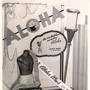
3 Aspects to Consider When Designing a Sign

Well-designed signs can help your business attract attention and get your message across to current and potential customers. Color, spacing, and font type are critical factors that directly contribute to the success of a sign. Here’s what to consider when designing yours.
What Qualities Make an Effective Sign?
1. Color
When choosing a color for your signs, make sure the print is legible. A pale color can look washed out and difficult to read. Rich, bold colors like dark blue and black easily stand out on a contrasting background. Also, consider that too many colors can be distracting.
2. Spacing
 Are your signs meant to be read close up or far away? Letter spacing can make a huge difference in the readability of your sign. Make sure the spacing between, above, and below the letters is appropriate because crowded letters can be difficult to read.
3. Font Type
A simple, bold font is usually the most legible. Make sure the font size is appropriate for the dimensions of the sign or banner. Also, consider if the font matches your business color scheme and design? For example, if you own a boutique, a script font may be appropriate, but it may not work as well for a financial business. If your company has a logo, you’ll want to make sure that the design is consistent.
For custom signs, flags, labels, and decals, contact Honolulu Sign Company Limited in Honolulu, HI. They have over 75 years of experience and are one of the only businesses in the area licensed to offer these services. Gain visibility and attention by utilizing their quality materials like redwood, acrylic, marble, tile, and aluminum. Call (808) 847-4047 to discuss your designs with a professional or visit their website to learn more about what products they offer.
About the Business
Have a question? Ask the experts!
Send your question

