4 Common Questions About Designing & Printing Business Signs

Whether you own a hardware store or run a food truck, you know that to be successful, you’ll have to convince customers to come to you. The signs your company displays are a big part of this. But with so many advanced options to choose from these days, how does one craft the perfect business sign? If you’re in the dark when it comes to commercial printing, here are the answers to some frequently asked questions.
Commercial Printing & Design FAQ
1. How large should my custom sign be?
When designing the graphics, text, and general size of your commercial printing project, you’ll want to consider its audience. If you’re hoping to draw in drivers from a block away, you’ll want the sign to be large enough to read from a distance in a moving car. However, if you’re marketing your business at a street fair, it should only be big enough to draw the eye of strolling pedestrians. Consider the proportions of the sign’s environment and choose a size that fits well in the space while still announcing your presence.
2. What colors should I use?
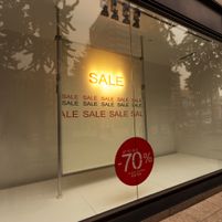 If you already use a specific color palette for your company logo or branding elements, go with the same two or three colors to maintain continuity. The ultimate goal is to increase awareness of your brand until most people recognize your company and remember your products or services at a glance. If you’re starting from scratch, work with a graphic design professional who can offer specific suggestions on what hues best evoke your virtues and goals.
3. What material is best for me?
Temporary signs, such as those promoting special discounts or upcoming events, don’t need to be constructed from metal and illuminated from within. However, it’s still important to choose a material that will remain in good condition for the duration of its display. Outdoor commercial printing products may be made of plastic or vinyl, while indoor signage could be canvas or posterboard.
4. Is the font really important?
The typeface you choose for your signs has two main objectives—to be easy enough for the average person to read and to appeal to your target audience. While a law firm might choose a much more reverent, formal font, a cupcake shop would appeal to customers with a lighthearted, jovial typeface. However, both choices should be legible and clear at first sight.
If you’re planning a commercial printing project, get in touch with Jones Printing Co of Sanford, NC. The company has been serving customers since 1885, riding the waves of countless industry changes over the years. If you need some help designing the perfect business sign, whether it’s a banner or a poster, call them today at (919) 774-9442 to get started. Visit the website for more information on their services.
About the Business

