The Do's & Don'ts of Business Card Design

When it comes to creating a successful business card, more often than not, less is more. Some people might get carried away overloading the design with too much information or distracting colors. But the most successful business cards follow a guideline of design do’s and don’ts. Curious what you should and shouldn’t be doing? Read on for a few helpful design tips to ensure your card makes the best impression on potential contacts.
Colors
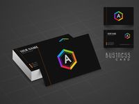 The best business cards are clear and easy to read. While vivid colors and exotic fonts are interesting, they can take away from the effectiveness of the business card. Instead, choose simple fonts and neutral tones. Feel free to add a pop of color to the card’s design if it complements your logo, but for the text, stick to dark hues like black, navy, and dark gray.
Shapes
While interestingly shaped business cards are sure to make an impression, it's best to opt for a standard square variety, instead. Normal business cards fit perfectly inside most wallets, making it easy for contacts to hold onto them. But an oddly shaped variety may not fit, making it much more likely that your business card will be lost or thrown away.
Contact Information
You may be tempted to include as much information as possible on your business card so your contact doesn’t forget you or have a hard time reaching you. But putting your name, business title, multiple phone numbers and email addresses, and maybe even a picture is overwhelming. Keep it simple—just include your most relevant information and the two best methods to get in touch with you.
If you’re ready to design a business card that will make all the right impressions, turn to the professional printers at Superior Printing Service in Hobbs, NM. With the option to place your order online, these experts make it easy to get the products you need. To speak to a member of their staff, call (575) 393-3261. Visit their website to see all of their printing services.
About the Business

