Printing Services Fit For a Prince: It’s All in The Font!

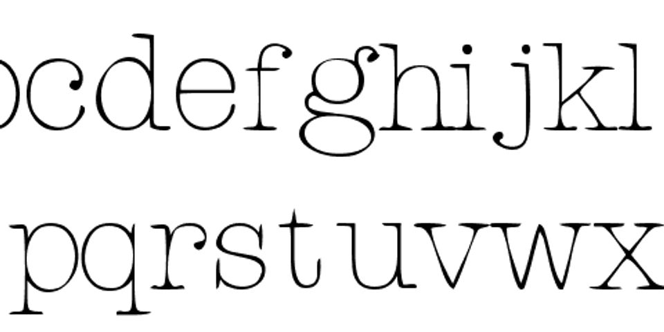
The printing services experts at Bestype Imaging know that on any printed design, whether it’s a brochure, bound book, or business card, the fonts used to convey an image speak as loudly as the copy. When utilized well, a font (or mix) focuses the reader’s attention, enhances the text’s general readability, and sets a tone for what the brand or business represents. Fonts, as much as graphics or physical designs, offer an opportunity to create a positive, lasting impression on a reader, as well as encourage repeated or long-term interest!
When picking a font, ensure that you choose one with a variety of letters; all-capital or all-lowercase designs have proved equally difficult to read. Additionally, as the saying goes, size matters! Most standard fonts look best between 10 and 12 points. These are the most common sizes, and they catch the eye on printed designs without reducing the content’s impact. Try to avoid overly elaborate styles, and while it is O.K. to mix fonts, make sure the patterns are consistent. Above all else, make sure that the print matches the medium, and when you need help, the best printing services company in NYC is here for you.
Make sure your digital prints speak as loudly as their copy by ordering brochures, posters, cards, and more from Bestype Imaging! The NYC printing service also offers same-day and rush printing, if immediate services are needed. For more information, or to see a full list of options available from Bestype Imaging, call (212) 966-6886 or visit the website.
About the Business
(160 reviews)
Have a question? Ask the experts!
Send your question

